ASOS Branding Campaign

To create a campaign for ASOS that celebrates self-expression, individuality, and optimism through a playful, amplified visual language. The goal was to extend ASOS’s brand identity across print, digital, and experiential formats in a way that feels current, confident, and culturally aware.

Type

Branding/Marketing

Role

Concept creator, Visual designer

Concept creator,

Visual designer

Industry

Fashion

The Process

I started by exploring how ASOS communicates boldness, inclusivity, and trend-forward fashion. I leaned into the concept “The Bigger The Better,” by using exaggerated human features (like oversized heads, hands, and facial expressions) to symbolize confidence and authenticity in a world that often tries to shrink us.

The project included ideation, sketching, and visual exploration across brand touch points. I developed billboard mockups, a promotional postcard, visually striking Instagram posts, and an annual report. All to be connected through a surreal, hyper-optimistic tone that encompasses big energy and individuality.
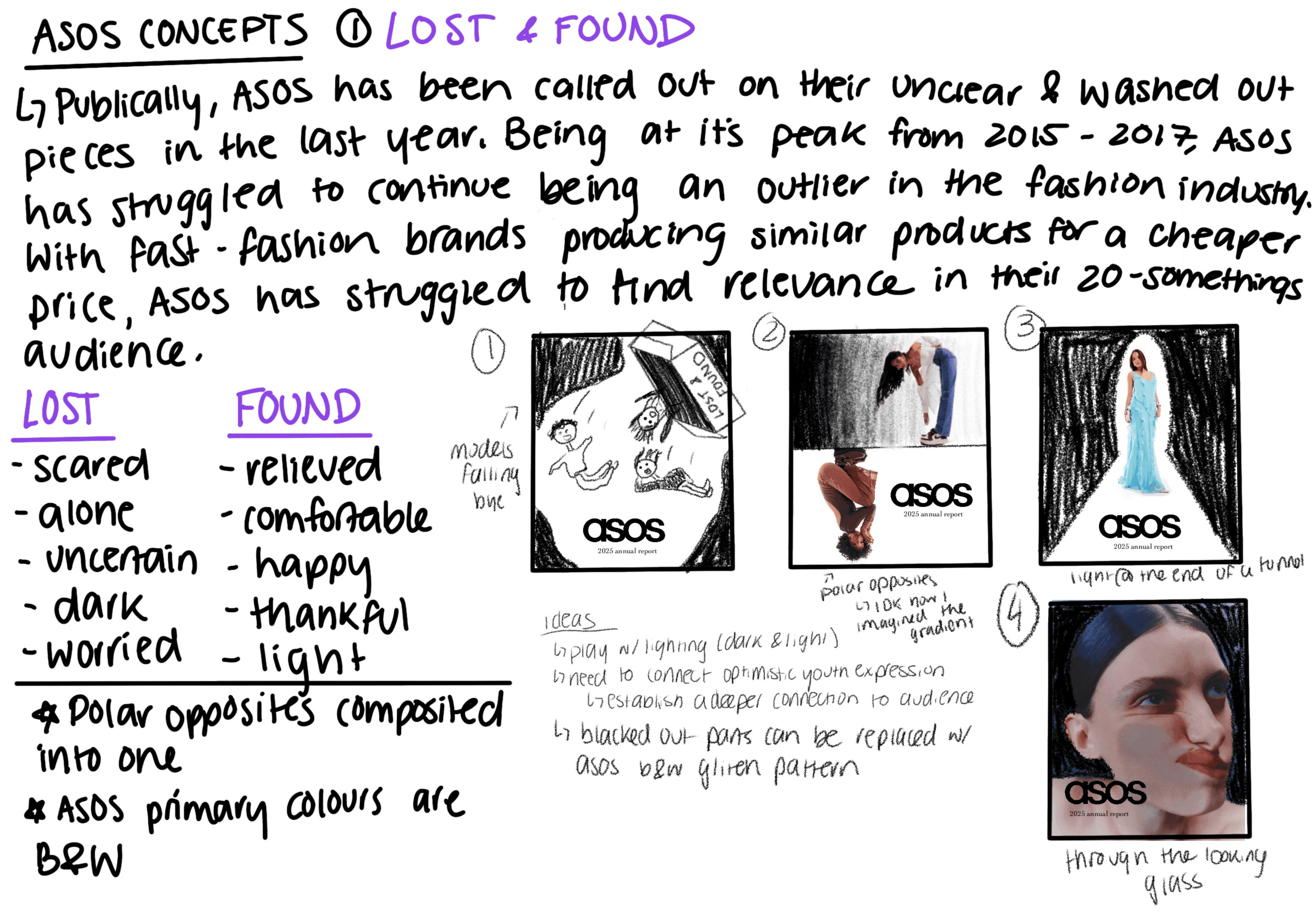
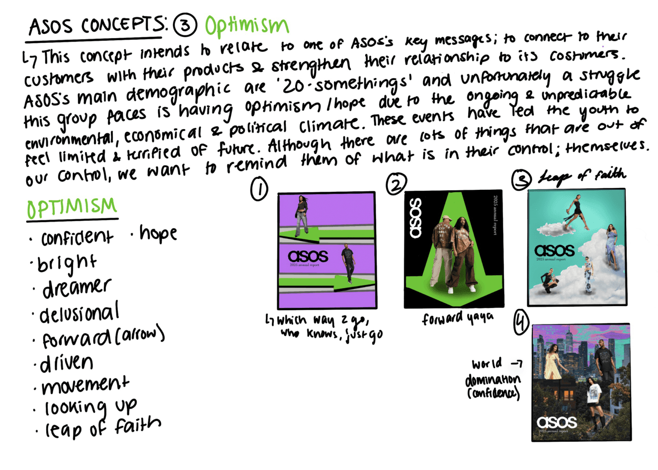
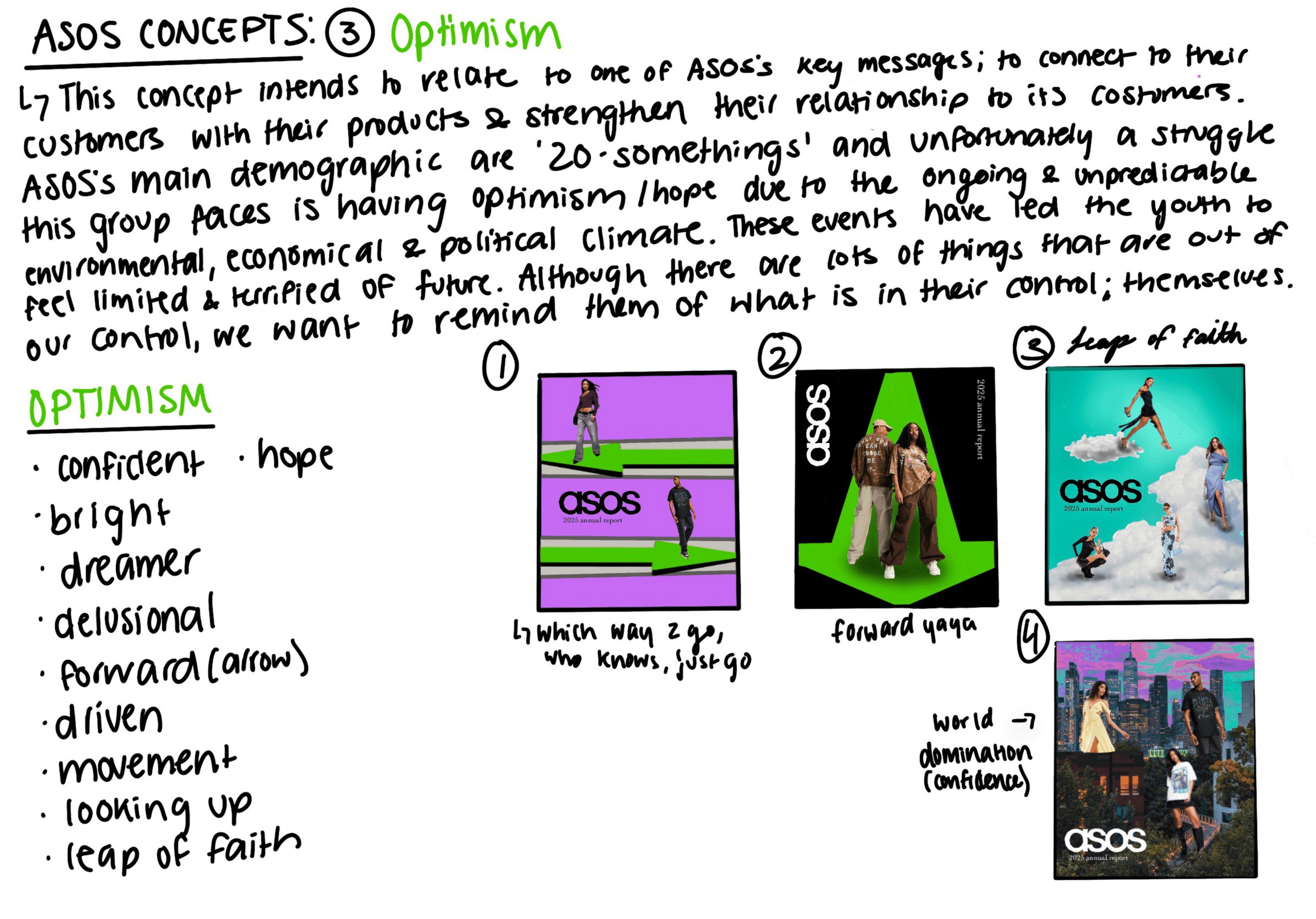
Concepts

I made 3 concepts to execute a clear and renewed vision to reconnect ASOS with it’s target audience of fashion-forward 20-somethings looking for a brand to help express themselves. From the concepts below, Concept #3 was the direction I decided to move forward with every promotional piece made.


2025 Annual Report

Campaign Billboard


Inspiration

Campaign Billboard


Inspiration

Campaign Billboard


Inspiration

Promotional Postcard

Shipping Box


Social Media Posts


Social Media Posts


Social Media Posts


Social Media Posts

Design Rationale

Throughout these collateral projects, I used the motif of a blue sky as a symbol of youth, freedom, and optimism. This sets as a reminder that cloudy days never last forever. Just as the weather shifts, nothing in life remains the same, yet the bright blue sky always returns.


This symbolism of nature reflects the essence of being human: growing up, changing, and continuously evolving.

View Other Projects