Wander: Conceptual Album Identity
Inspired by Frank Ocean
Overview: A conceptual album identity for Wander, a fictional project exploring themes of introspection, emotional duality, and personal evolution. Inspired by the tonal depth and visual restraint often associated with Frank Ocean, the goal was to translate a deeply atmospheric sound into a cohesive and expressive visual system.
The project focuses on building a world that feels both intimate and expansive while balancing minimalism with subtle surrealism to reflect the complexity of human emotion.

Concept and Direction
At its core, Wander explores the idea of existing between emotional states; holding both discomfort and peace at once. This duality informed a visual language built on contrast: symmetry and distortion, stillness and movement, muted tones and moments of vibrancy.
Rather than relying on literal storytelling, the direction leans into abstraction; allowing colour, composition, and typography to evoke feeling over explanation.
Process
The project began with research into the emotional and visual language surrounding alternative R&B and jazz influenced music. I developed three distinct visual directions through moodboarding and sketching, each exploring different interpretations of tone, texture, and composition.
These concepts were tested through layout studies and typographic exploration, focusing on how minimal elements could still carry emotional weight. The final direction emerged from combining key aspects of all three explorations into a unified system.


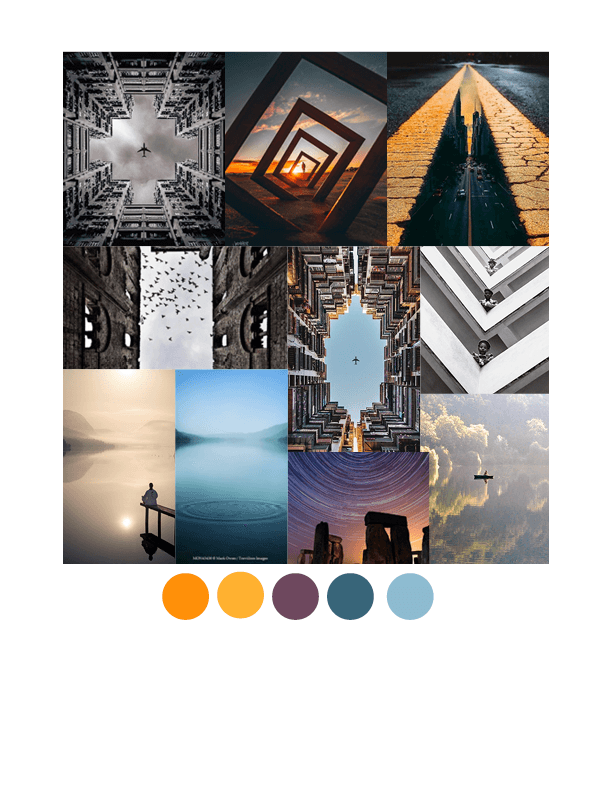
Sketches


Vinyl Cover


Promotional Posters

Execution
The final album cover serves as the central expression of the identity that pairs restrained typography with a surreal, emotionally charged visual. Supporting applications extend this language across vinyl packaging and additional touchpoints, ensuring consistency while allowing for variation within the system.
The result is a minimal yet immersive identity that captures a feeling of quiet intensity and reflection.
Design Rationale
The visual system is rooted in the idea of emotional duality. Through the use of symmetry, negative space, and contrasting tones, the design reflects a state of “radical acceptance”, where opposing feelings coexist rather than resolve.
Instead of guiding the viewer toward a single interpretation, the work invites personal reflection; mirroring the way music is experienced differently by each listener.
This is a self-initiated conceptual project and is not affiliated with or commissioned by Frank Ocean.


Social Media Posts