To design a weather-based lifestyle app that helps users prepare for their day with confidence—focusing on intuitive UX, personalized recommendations, and a more emotionally aware approach to daily forecasting.

Type
UI/UX Design
Role
UI Designer
Industry
Lifestyle/Consumer Technology
About OhMe!
The Goal
For the FLUI Hackathon 2025, my team and I were challenged to design a digital experience that showcases OHME!’s unique value, strengthens community engagement, and drives both retail and direct-to-consumer sales.
Our goal for their website redesign was to integrate the clients needs of a creative blog section while enhancing their user's experience.
Problem Statement
OHME! Foods wanted to improve their online presence by:
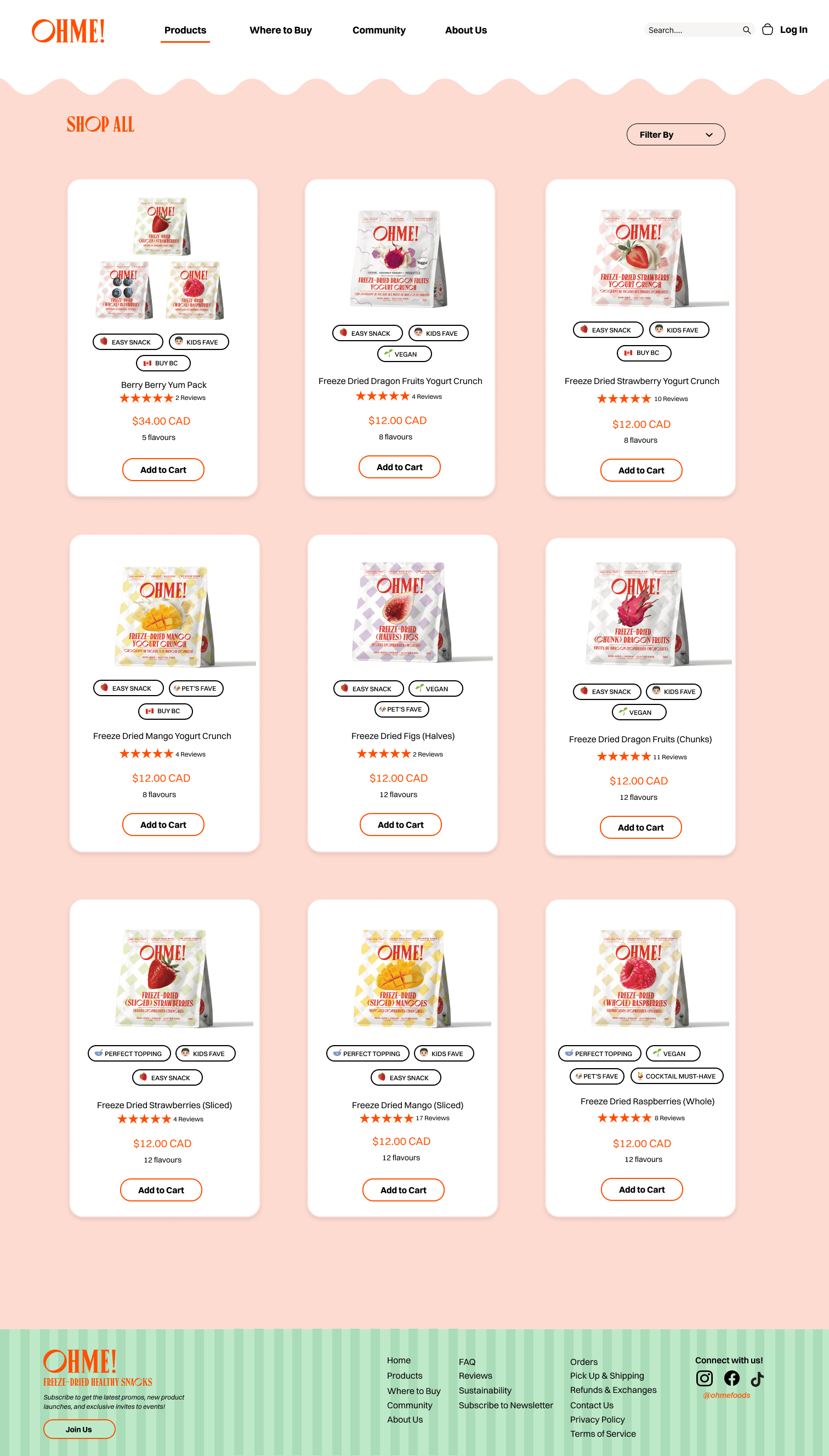
Showcasing the Berry Berry Yum Pack with a seamless subscription shopping flow.
Highlighting customer stories, reviews, and ambassador content to build trust.
Providing creative ways to use their snacks while reinforcing their health benefits.
Driving retail interest by spotlighting in-store availability and B2B potential.
The core challenge was:
How might we design a web platform that highlights OHME!’s strengths, builds consumer trust, and increases sales, while staying fun, natural, and approachable?.
Research and Insights
From the client brief, we identified several opportunities:
Review Section: A stronger review experience through judge.me integration, including photo-based testimonials.
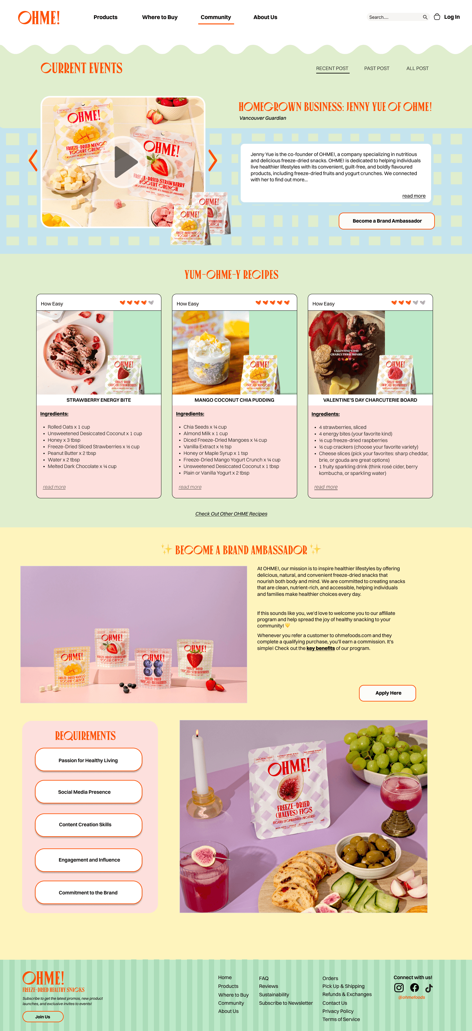
Creative Blog: A dedicated space for recipes, brand news, and social events, ideally with shoppable features.
Product Showcasing: A unique slider layout to display products in an engaging, memorable way.
Design Aesthetics: The client valued styles ranging from maximalist and exciting to soft, retro nostalgia and editorial photo-centric.
We also asked key rational questions:
What makes OHME! different from competitors?
What is the user’s key problem?
How can we make their shopping and brand experience effortless and joyful?
The Process
• Brainstorming & Moodboards: We mapped design directions against the four aesthetics; balancing vibrant, playful energy with trusted, editorial credibility.
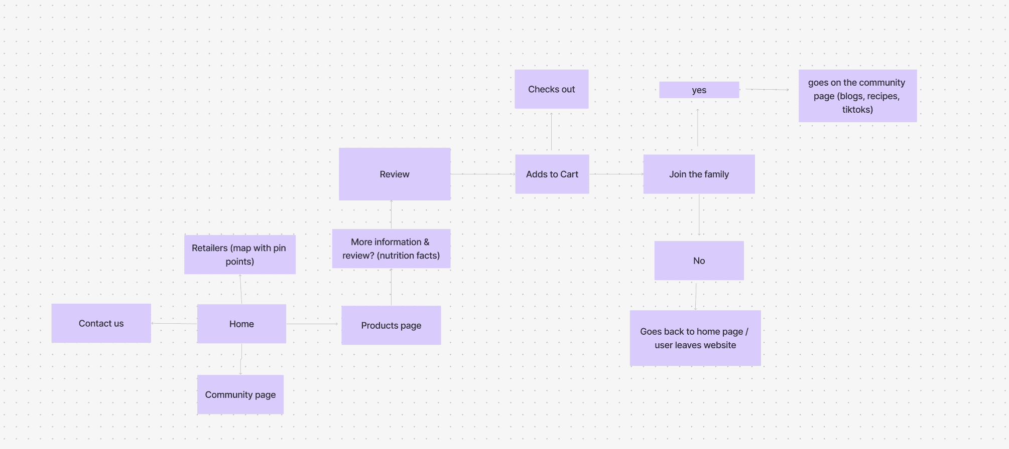
• User Flow: Showing a general flow to ensure we focused on three primary journeys; product discovery, check out, and community engagement.
• Wireframes: Sketched core sections (homepage hero, product detail page, interactive reviews, community page).
• Prototype Iterations: Adjusted based on mentor feedback to make navigation more intuitive and highlight the Yum Pack product page earlier in the flow.

HiFi Wireframe
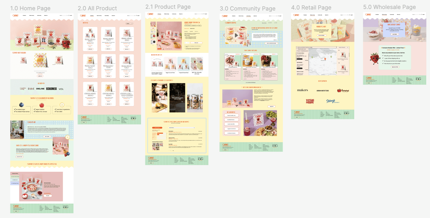
Final Design Solution
Our solution brought together storytelling, shopping, and community into a cohesive platform:
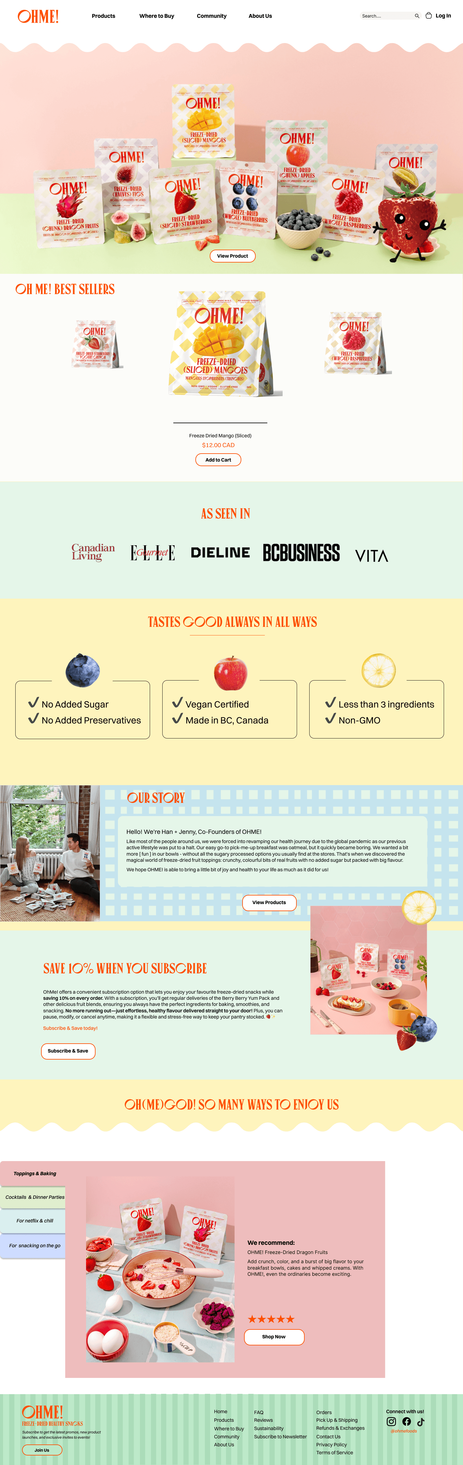
Homepage Hero: Spotlighting the Berry Berry Yum Pack with subscription options.
Review Section: Integrated judge.me for scrollable, photo-based customer reviews.
Blog Hub: Featured recipes, brand news, and social content, with embedded shoppable links.
Community Space: Ambassador highlights, customer stories, and social media integrations to reinforce brand trust.
Retail Showcase: A dedicated section for retail availability and future B2B partnerships.
Product Slider: A unique, interactive carousel designed to make each product memorable.

Impact and Outcomes
The design concept successfully:
Enhanced trust by showcasing authentic reviews and community content
Increased engagement with recipes and 'shoppable' blog features
Streamlined the shopping experience with subscriptions and product sliders
Strengthened brand positioning through playful yet professional design aesthetics
Reflection and Next Steps
This hackathon project highlighted the balance between business goals and user needs. Given more time, we would:
Conduct usability testing to validate the shopping flow
Explore mobile first refinements
Expand the retailer section for B2B opportunities
Overall, the project reinforced how thoughtful UI/UX design can bridge convenience, nutrition, and storytelling!